Material Libraries: How to Choose the Right Textures for Photorealistic 3D Rendering
Introduction
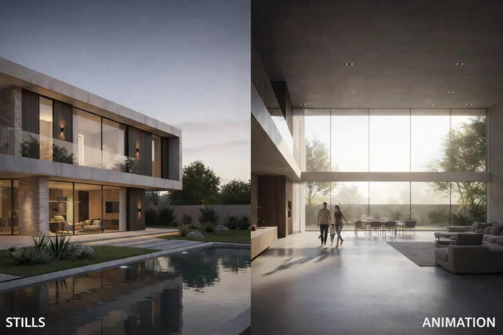
Material Libraries Guide principles are at the heart of every successful architectural visualisation project. Before lighting is perfected or cameras are positioned, textures define how believable a space feels. Whether you are working on a luxury villa or a compact 3D rendering home concept, material selection sets the emotional tone of the scene.
In modern architectural visualisation, viewers expect realism. Flat or incorrect textures instantly break trust. A reliable Material Libraries Guide helps designers choose surfaces that respond naturally to light, scale, and perspective. This is why professional studios invest heavily in well-organised and calibrated material libraries.
Why Material Libraries Matter in Architectural Visualisation
In architectural visualisation, textures do far more than decorate surfaces. They communicate age, quality, climate, and usage. A concrete wall in an industrial loft should feel different from polished stone in a modern residence. The Material Libraries Guide ensures that these differences are visually accurate.
High-quality libraries usually contain multiple maps such as color, roughness, normal, and displacement. Together, they allow materials to behave like their real-world counterparts. This becomes especially important in 3D rendering home interiors, where close-up camera angles reveal even the smallest flaws.
Professionals working in architectural visualisation rely on tested libraries to reduce guesswork and maintain consistency across projects. According to industry standards shared by platforms like Chaos Group (V-Ray) and Blender Foundation, physically accurate materials are essential for photorealism.
🔗 DoFollow external resource:
Chaos Group official site
Understanding Texture Behaviour in 3D Rendering Home Projects
Every 3D rendering home project presents unique challenges. Interior scenes demand subtle reflections, while exterior architectural visualisation requires materials that respond correctly to sunlight, shadows, and weathering.
The Material Libraries Guide encourages designers to study how textures react under different lighting setups. A wood floor may look perfect under soft daylight but appear overly glossy under artificial lighting if roughness values are incorrect.
This is why professional architectural visualisation workflows always include test renders. Adjusting materials early saves hours during final production and ensures visual consistency throughout the project.
How Professionals Apply the Material Libraries Guide
Experienced studios do not randomly apply textures. They follow a structured Material Libraries Guide process that begins with understanding the purpose of the space. A residential 3D rendering home focuses on warmth and comfort, while commercial architectural visualisation prioritizes durability and scale.
Most professionals organise libraries by categories such as stone, wood, metal, fabric, and concrete. This approach speeds up decision-making and ensures visual harmony across scenes. Over time, designers develop a strong intuition for how specific materials behave, improving both speed and quality. Learn more about our architectural visualisation workflow
Choosing Texture Resolution and Maintaining Realistic Scale
Resolution plays a critical role in architectural visualisation quality. The Material Libraries Guide recommends matching texture resolution with camera distance. Close-up shots in 3D rendering home kitchens or bathrooms often require 4K or 8K textures, while background surfaces can use lower resolutions.
Scale accuracy is equally important. Incorrectly scaled tiles or oversized wood grains immediately signal artificiality. Professionals often reference manufacturer dimensions or real photographs to ensure materials remain believable.
This disciplined approach separates amateur work from professional architectural visualisation.
Lighting, Mood, and Material Interaction
Lighting and materials are inseparable in architectural visualisation. The Material Libraries Guide emphasizes testing textures under multiple lighting conditions, including HDRI environments, natural sunlight, and artificial fixtures.
In 3D rendering home scenes, lighting reveals texture depth and surface imperfections. Overly smooth materials may look unrealistic, while subtle roughness adds authenticity. Designers often introduce micro-details to avoid a “computer-generated” appearance.
According to Adobe Substance 3D, realistic material response under varied lighting is a key factor in viewer trust.
external resource:
Adobe Substance 3D
Balancing Realism and Artistic Direction
While realism is essential, architectural visualisation is also a form of storytelling. The Material Libraries Guide helps designers balance technical accuracy with creative expression. Matte concrete can convey calm minimalism, while glossy marble communicates luxury.
In 3D rendering home projects, this balance becomes personal. Clients often choose designers based on emotional connection, not just technical perfection. Carefully chosen materials guide the viewer’s eye and reinforce the design narrative.
A strong material library supports multiple styles without compromising realism.
Common Texture Mistakes and How to Avoid Them
Even experienced designers occasionally make mistakes. The Material Libraries Guide highlights common issues such as excessive gloss, repeated texture patterns, and mismatched color temperatures.
Rather than overloading scenes with extreme reflections, professionals aim for subtlety. Real materials are imperfect, and embracing those imperfections enhances architectural visualisation realism.
Regularly updating your library and removing outdated assets keeps your 3D rendering home projects visually current and professional.
Building a Smart and Scalable Material Library
A well-curated library is more valuable than a massive one. The Material Libraries Guide encourages quality over quantity. Premium, PBR-ready materials with proper naming conventions save time and reduce errors.
As architectural visualisation skills grow, designers gradually add scanned and procedural materials. These advanced assets improve realism and offer greater control over surface details in 3D rendering home environments.
Consistent organisation also makes collaboration easier, especially in studio settings.
Conclusion
The Material Libraries Guide is more than a technical reference—it is a creative framework. Whether you are developing a small 3D rendering home concept or managing large-scale architectural visualisation projects, material choices define credibility and emotional impact.
By understanding texture behaviour, scale, lighting, and realism, designers create images that feel lived-in and believable. Over time, your library becomes an extension of your design voice.
Refining your approach to materials ensures every scene communicates quality, trust, and visual depth—key elements that set professional architectural visualisation apart.